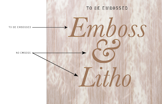
Here is my base image, I'm just going to prepare the word 'Emboss' for embossing, so the final product will have the word printed and embossed.
- When you emboss - the printer needs the embossed portion to be a solid color, so it can be 100% Cyan or 100% Yellow - the 100% Magenta is usually a good rule to follow as you'll notice straight away what portions are being embossed (unless you've used a lot of plain magenta in the design)

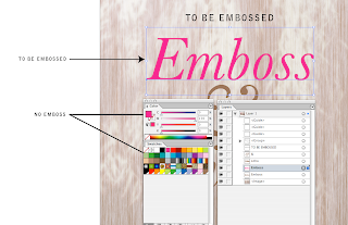
I've duplicated the word I want Embossed (see the layers pallette) and I've made it 100% of an obvious color.
- The embossed plate for the printer also needs to be made up of ONE color - so make sure that your embossed portion is changed to a 'Spot' color (it must not be a process color - unless the card is one/spot color).
- You could even make your embossed area from a spot Pantone that shows up as as a 10% yellow, but it would still be 100% of that spot Pantone... and renamed 'Emboss' - it must be a SPOT color.
- The emboss needs to have sharp/crisp edges (it is traditionally made from a solid block of metal -like old fashioned letterpress) hence the requirement for it to be a vector (you can do vectors in photoshop). So choose a font that will lend itself to sharp crisp edges, or make sure your graphic element has sharp crisp edges.
- You need to manually set the color to overprint - so that depends on what app you're using, if you're using Illustrator you can do this in the 'Attributes' pop up (from the 'Window' menu). Select the item to be embossed and check the 'overprint' option here.
To check your overprint
- If you check the 'Overprint Preview' it should show the embossed portion as a darker color. Let me try clarify what I mean: When the preview is off you should see the embossed portion as say 100%M. When you click 'Separation Preview' on, the 100% Magenta should look like 100% transparent Magenta (it looks similar to what happens when you use 'multiply' in photoshop')

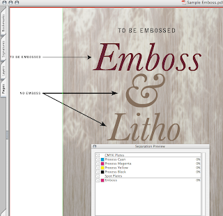
The 'Emboss' plate displaying as a spot color in Adobe Acrobat.
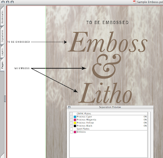
- If you can view your file in Acrobat Professional check your colors when you switch on the 'Separation Preview' (from the Advanced' menu) The embossed portion should display as a spot color (preferably named 'Emboss') and it should not knock out any of the colors behind it (if you switch the 'Emboss' off, you should still see all the design elements on your card behind it.

The 'Emboss' plate clicked off to show items underneath in Adobe Acrobat.
- If you don't have Acrobat Pro, then print color separations and make sure the embossed portion prints on it's own plate and does not knock out any of the elements behind it.
- Convert your text to outlines/paths if you're not going to make a PDF for print.
There are quite a few variables that need to be taken into consideration when prepping a file for special printing techniques. I've just covered some of them in this tutorial.
If you thought this was helpful, let me know.


0 comments:
Post a Comment
I'd love to hear from you.