This blog is moving -
check out my new blog here.
Friday, November 20, 2009
Thursday, October 22, 2009
I had fun creating these layer styles for photoshop. They're great to use as a fun n' funky way to add emphasis to your type. Looks really good when used on a chunky font. Check it out on Graphic River - a total 18 variations to choose from for only $2
Saturday, October 3, 2009
24/7 Royalty Free twitter background
Another graphic I've just added to my royalty free portfolio. A twitter background that can also be used for any web project. Easily customized for a service that operates 24 hours or for a personal twitter page. Check it out here 24/7 Twitter Background
Monday, September 28, 2009
Here's my latest contribution to my royalty free portfolio, I discovered a new royalty free site called Graphic Leftovers so I decided to give it a try.
Looking for a graphic element for your eco friendly project? Here's a choice of 6 button badges to glam up your next green project for only $1.
No deforestation took place during the production of this artwork!
Layered PSD file of tree button badges. You can use photoshop CS1 and up to open this file.http://graphicleftovers.com/graphic/green-badges1/ Easily editable as layer styles have been used on some elements Foiage, trunk and button badge are each on their own layer.
Tuesday, September 8, 2009
Preparing a file for Embossing
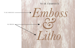
Here is my base image, I'm just going to prepare the word 'Emboss' for embossing, so the final product will have the word printed and embossed.
- When you emboss - the printer needs the embossed portion to be a solid color, so it can be 100% Cyan or 100% Yellow - the 100% Magenta is usually a good rule to follow as you'll notice straight away what portions are being embossed (unless you've used a lot of plain magenta in the design)
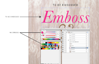
I've duplicated the word I want Embossed (see the layers pallette) and I've made it 100% of an obvious color.
- The embossed plate for the printer also needs to be made up of ONE color - so make sure that your embossed portion is changed to a 'Spot' color (it must not be a process color - unless the card is one/spot color).
- You could even make your embossed area from a spot Pantone that shows up as as a 10% yellow, but it would still be 100% of that spot Pantone... and renamed 'Emboss' - it must be a SPOT color.
- The emboss needs to have sharp/crisp edges (it is traditionally made from a solid block of metal -like old fashioned letterpress) hence the requirement for it to be a vector (you can do vectors in photoshop). So choose a font that will lend itself to sharp crisp edges, or make sure your graphic element has sharp crisp edges.
- You need to manually set the color to overprint - so that depends on what app you're using, if you're using Illustrator you can do this in the 'Attributes' pop up (from the 'Window' menu). Select the item to be embossed and check the 'overprint' option here.
To check your overprint
- If you check the 'Overprint Preview' it should show the embossed portion as a darker color. Let me try clarify what I mean: When the preview is off you should see the embossed portion as say 100%M. When you click 'Separation Preview' on, the 100% Magenta should look like 100% transparent Magenta (it looks similar to what happens when you use 'multiply' in photoshop')
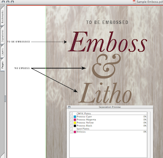
The 'Emboss' plate displaying as a spot color in Adobe Acrobat.
- If you can view your file in Acrobat Professional check your colors when you switch on the 'Separation Preview' (from the Advanced' menu) The embossed portion should display as a spot color (preferably named 'Emboss') and it should not knock out any of the colors behind it (if you switch the 'Emboss' off, you should still see all the design elements on your card behind it.
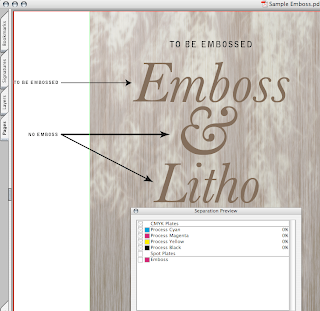
The 'Emboss' plate clicked off to show items underneath in Adobe Acrobat.
- If you don't have Acrobat Pro, then print color separations and make sure the embossed portion prints on it's own plate and does not knock out any of the elements behind it.
- Convert your text to outlines/paths if you're not going to make a PDF for print.
There are quite a few variables that need to be taken into consideration when prepping a file for special printing techniques. I've just covered some of them in this tutorial.
If you thought this was helpful, let me know.
Tuesday, September 1, 2009
Big Sky Country Web Page Background
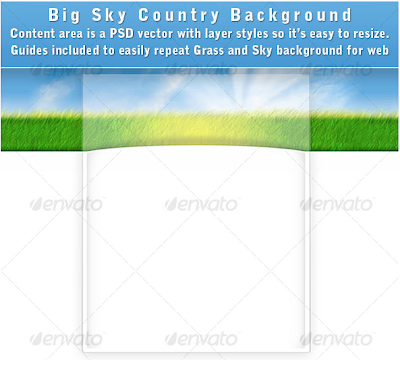
Think green, clean country air and nice white space. Think fresh and simple, soft, fluffy grass and lots of sky. Here’s the perfect layered PSD file to match.
:: Subtle curve on the main content area give it depth.
:: The main content area is a vector with a layer style so it can be easily resized and customized.
:: Guides included to indicate which area of the grass can be used to repeat along the x axis.
:: Move the sunburst around if you prefer it in another spot.
Still interested? Look for it on Graphic River under Tamixes for only $2.
Saturday, August 22, 2009
Original T-shirt
Subscribe to:
Posts (Atom)


